Today, my timetable meant that I had around 4 and a half hours in school where I was able to edit and as there was a school production that evening too I was able to stay till 10 o'clock in the evening to maximise my time in the edit suite. After spending all the time in the edit suite, including breaks I edited the whole first drop, along with the build up and transition into the next verse. I feel my time was used incredibly productive since I experimented with lots of new tools that I had never used before and came across this one tool which I'd never seen before but I had hoped to find. The spherise tool let me do this blowing up screen effect, similar to what I had seen in the club scene in the film 'Limitless' and I had brought this effect to the attention of my group early on in the project.
I showed this clip to Chris, our media technician and he thought it looked superb. He asked how I managed to do it and more particularly he was interested in how I gave the shot a vivid cyan overlay. Again I found this through experimenting with the effects and I actually achieved this by mistake. In the colour correction section, I used the RGB curves tool because I wanted to increase the amount of red, but when I dropped the reds and came across this colour I felt this actually looked a lot better.
We showed her the video when the rough edit and a decent proportion of the fine edit is complete so we were able to get thorough feedback. She told us to make three amendments:
1) She understood that the narrative shows the teacher going through a progression of confidence, however the stages of her character development needed to be in the correct order, when at the moment it is not. So we need to amend for this, which will only require moving a few shots around.
2) The transition where the teacher starts accepting the chaos and joining in needs to be more obvious. For this I need to arrange the slo-mo jump shots to allow more time to see the teacher letting down her hair.
3) The pace of the build up to the first drop is too fast. To change this I need to remove much of the strobe and slow down the shots showing the students getting up.
Other than this she feels the video is of high quality editing, and although there is still time and room for improvement, the presentation of the narrative was clear and enjoyable to watch in combination with the performance.
During the post-production stage we knew we needed to be efficient in managing our time so we designated the three task between us. Adam concentrated mainly on the album cover, Michael on the website and I on the video. Conveniently, we were able to position ourselves in the roles which we all preferred to do. This will allow us to produce the best possible quality products we can because we will have no problem in focusing on our individual task and producing the correct amount of work to the deadlines we set ourselves.
Today we had the second performance shoot which is also our final shoot all together!
This time round we were much more prepared, having planned out the shots we missed out from the first shoot and we were much more efficient in setting up the lights and also getting into character since we had the confidence from the last time.
We had to make sure this time that we corrected an issue with the camera which resulted in grainy footage from the last shoot, but that wasn't a problem.
I'm happy to say the shoot was a success and I can't wait to watch the footage back when we capture.
The track we have selected is the Skrillex remix of Nero's 'Promises'. It is dubstep and since I am a fan of the dubstep genre I feel that I will be able to produce a high standard end product since I understand the conventions of music videos of the genre, like excessive slo-mo, fast paced action in the narrative, either the artist has a hidden identity or doesn't show themself at all and usually videos have a very urban and rough feel to them. Here are a few music videos which inspire me:
Modestep - Feel Good
Modestep - Sunlight
Example - Kickstarts (Bar9 remix)
DJ Fresh - Louder (ft. Sian Evans)
Skrillex - First of the year (Equinox)
After watching the film 'Limitless' I was stunned to see the creativity and individuality of the cinematography. There was one scene in particular which can relate to a music video. The main character is in a club and the visuals have been edited to give an effect where the screen pops out like a bass speaker. This is hopefully an effect I will be able to achieve in my music video.
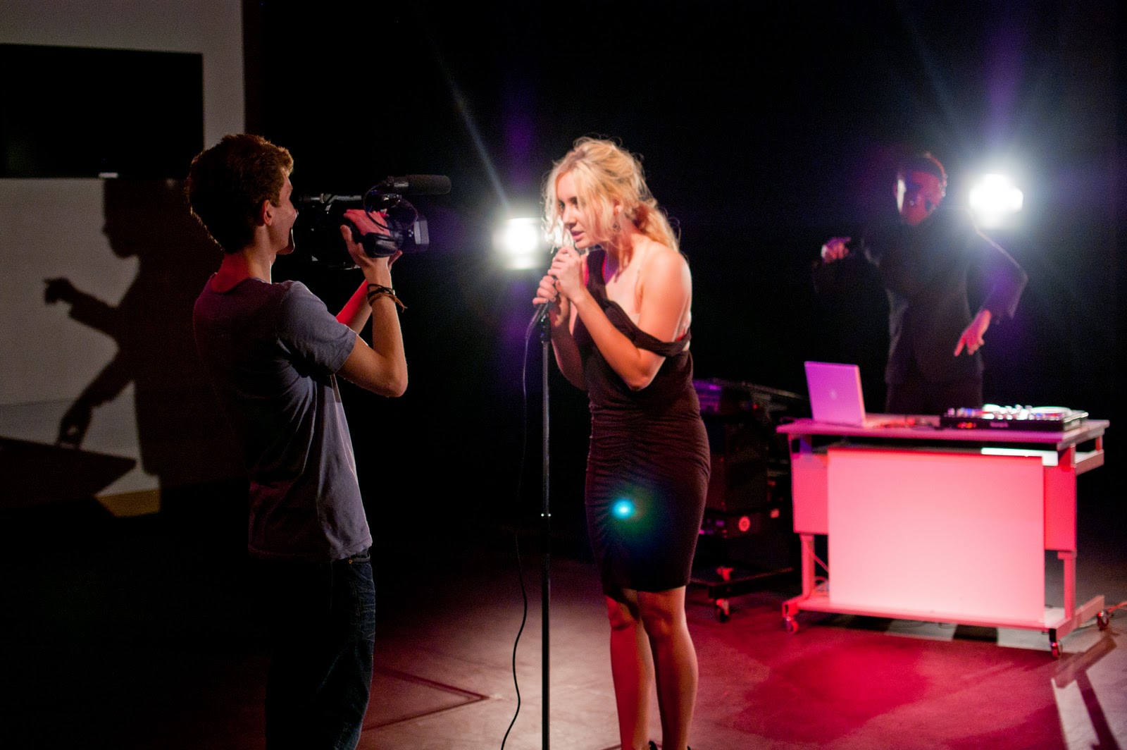
Today, we conducted a promo shoot for our artist, Influx, in order to promote our artist image and create images for the fanbase on our website and album cover.
We varied the depth, lighting and mood of the shot to entice the audience into divulging further into our campaign.
At first, we used the same costumes we wore when shooting the performance for the music video (Charley: sophisticated black dress with a dropped shoulder strap, DJs: Black suits, shirts and shoes, along with our iconic masks and headphones.)
We then changed the costume for added interest and variety.
Finally, we had another costume change so that the DJs were wearing casual clothing, with particular emphasis on wearing a hooded jumper, since this type of clothing is commonly associated with the clothing that is worn by the target audience. With this added grunge look, we can look to reach further into our target audience because it allows the audience to relate to the band, and this interactivity that is contemporary and very popular with the audience.
Here are a few of the shots taken that dat which have been edited for the website.
I love this advert so much and when I first saw it in the adverts during the XFactor my mouth dropped in amazement. As soon as I could I went straight to YouTube and watched it again. I feel compelled to blog about this since I understand that this effect of replayability being a must-do is crucial and of vital importance in our own music video.
This is a commercial advertisement presented as a dubstep/house music video, which is relevant to my media project. There are clear examples of cutting to the beat and showing that the action and choreography of the girl, dancing teddy bears and movement of objects in the room is to the beat as well. My favourite part of the video is the drop where the camera pans, zooms out and in with the stationary objects and furniture of the room all moving in time with this slo-mo change in pace of the track. Visually, it looks incredible and its this experimenting with the camera which I can withdraw from the most in this advert and use it to my advantage in my music video.
I’ve decided to analyse the album cover for Muse’s album `Black holes and Revelations` more closely. This album was released in 2006 and targets an audience of around 16-35s both male and female with its very mainstream music.
I feel that the cover most noticeably uses a blue and orange colour scheme since these colours are known for working well together due to their position as opposites in the colour wheel. These colours have been strongly saturated and contrasted to create more vibrant colours. Also, these colours have been set to divide the cover between top and bottom, perhaps dividing the black holes above from the revelations of the music below.
A quirky band identity is conveyed through the iconography by having 4 bald men sat around a table on this red planet (connotations of mars) even though these people aren’t the band members. Doing this also adds a mysterious feel to the album with enigma.
The artist’s name and album title goes against conventions through being black on a dark blue background so that it isn’t as prominent as expected on the cover. Perhaps this is because it is one of their later albums (their 4th album released) and so they can get away with not promoting their name as strongly.
The background image of the red planet flows onto the back cover to creating this sense epicness and enigma towards the content of the album. the track lsit is written in white so it doesn't distract you from the background image and institutional information (bar code, record label etc) is conventionally placed alogn the bottom so the audience knows where these features are immediately.
The narrative follows the lyrics very closely and so we have a form of amplification. It shows the girlfriend of each member of the band cheating on them with another guy, who is the same guy in each case. The flow of the narrative feels choppy and fragmented, however it is still clear to follow. The narrative doesn’t really feel like there is closure, perhaps suggesting that this is an ongoing issue and the audience can relate to this.
2)Editing
The song has a moderately slow beat, however the beat itself is quite clear so the visuals are cut to the beat. This means the actual flow of the editing is quite slow, but when it’s the chorus the editing gets a bit more lively, for example there is a jump shot phrase where the 30 degree angle is broken (2:30 - 2:32).
The video is dominated by slo-mo shots to keep contemporary with the changing audience of today’s music videos.
The narrative, although has continuity in terms of the content, is not edited with continuity techniques.
) 3) Camera movement and framing
The performance has many low angles and shots, which include the whole band. These are conventional of a boy band music video. There are also many beauty shots of each member of the band, both in performance and narrative.
The camera is rarely stationary, there is usually a subtle movement of the camera either panning or tilting to ensure the video feels like it is constantly moving.
4)Diegesis
The performance has a grey/blue grading to evoke a dreary atmosphere, and the fire going up in the background and the fire engulfing the piano combine to show the rage and frustration of each band member due to their girlfriends cheating on them.
Often the fire going up in the back is time to the music and in slo-mo to allowing the audience to see every detail. This is particularly in the opening shot of the video.
The narrative is in a small bedroom for most of it, which feels claustrophobic and brings the narrative to a more realistic and personal level.
I researched a variety of album covers stretching across several decades and from doing this I was able to pick out the key features and conventions of the album cover’s composition. These features are:
Album title
Artist name
Record label logo
Image of artist
Track list
Bar code
Website details of artist (for more recent albums)
Album covers can be categorised in other ways than generically. I have discovered that you could categorise them through decade of release, record label (i.e. whether the artist is part of capital rich or independent label), the artist themselves (their own house brand as it were) in the case where there may be several albums by a single artist and the artist’s fanbase.
From my research I think it’s clear that the album cover is designed to stand out on the shelf or in an online store with their target audiences, particularly the hardcore fanbases at the forefront of the designs. Often the independent artists and older album’s (dating back to vinyl) will include detailed illustrations and often the case with more dark music with heavy themes will have fairly dark colour schemes in order to create a dreary and gloomy vibe.
For an artist’s debut album, there are particular features which are emphasised to promote the artist’s overall brand image and so they immediately become recognisable in the eyes of the public to attract new audiences. Conventionally the artist’s name and an image of the artist with a very specific and thought out appearance (facial expressions, dress codes etc) will dominate the cover.
For this shoot we had already shot and edited a sketch video narrative storyboard as preparation. Charley was the actress for this shoot, and here is a picture of her in her teacher costume.
This enabled us to be efficient with our actors so they wouldn't get bored and so that we could film everything we wanted in the time constraints (Charley had to leave for a lesson later in the day). I felt that the shoot went incredibly well, and I was happy that this time I was able to direct and work the camera. I had to be spontaneous with the dancing shots, but my job was made much easier by the fact that all our actors were other media students her understood our situation and were able to get into character very quickly. I took some shots from interesting jaunted angles and used many shaky handheld camera and zoom techniques so I look forward to re-watching the footage when we capture it.
This is the video narrative storyboard which we had prepared in advance.
After having 2 production shoots and capturing the footage (for the first shoot) we have realised there is still much to do in the way of constructing a believable and relevant narrative. Chris was with us in the shoot on Saturday 5th and we received feedback from him saying "the dancing felt inappropriate and didn't convey the ideas we wanted."
Today Daniel had a meeting with Miss Blackborow and discussed the issues to do with the teacher suddenly blaring music during the test in class and creating a narrative which is appropriate and works well with the performance and the artist.
We have decided to cast Charley as the teacher due to difficulties in getting Lauren to the school and ensuring time is used efficiently and we feel this way there is a stronger connection betweent he narrative and the performance. Effectively, we are going back to an initial idea by the group where the narrative merges into the performance.
I used the rough timeline Michael and I created at lunch to take notes. We are going to include a 20 second prologue in which there is the introduction to the class room environment (teacher entering classroom with test papers). The song starts as the ideas below take hold.
We have two possible ideas to be used for the entrance to begin the dancing:
After giving out the test papers and telling the class to begin, the teacher sits down, plugs in her headphones and starts listenign to music quietly whilst marking work - this is when the song will begin. A naughty student leans over the teachers desk allowing the music to blare loudly. This leads to many hysteric reaction from the class as well as the teacher and everyone starts dancing to the music.
Again, the teacher sits down after giving out the test and she opens an email with the !NFLUX music video in the email window. Suddenly, there is an error message and from hear the song would start. The image on screen begins to break away leaving behind the music video in full screen, with the music blaring and everyone dancing.
Currently we are more inclined to do the first option due to the practicalities involved in creating this email.
From the second verse, the DJs begin to get involved with the narrative. We will create much build up other their entrance through many slo mo shots of them approaching the classroom and with the reactions of the students and the teacher when they first see them. During the bridge, the DJs set up their equipment (decks and keyboard) on the teacher's desk and gradually students melt away from the classroom to leave just the band (now including Charley). At the drop following the bridge, there will be a BCU of Charley addressing the camera, with her jumping backwards (and perhaps a focus pull) to act as a transition between Charley as a teacher and Charley as a member of the band.
To bring the music video full circle, the final few shots will be of Charley leaving the classroom with the test papers.
It's only a few days after the last shoot, so it's still fresh in our minds. With that experience we were able to set up much quicker and act much more efficiently with the camera and lighting throughout the morning that we got to shoot.
My friend Lauren was our actress for the narrative and she played a science teacher who was holding a class back to do a test. After the test begins she looks at her laptop and starts listening to the track, when she starts dancing around the room.
The shoot wasn't successful since we realised that the idea was flawed in that it was too provocative, the location wasn't very nice and left too much clutter in the background of the shots and we now don't feel that Lauren is suitable for the part.
We will discuss the possible changes when we come back to school.
We have just had our first performance shoot and although it felt like we started slow, we soon got into our roles and became much more efficient on set. I expected that to happen to an extent anyway.
The performance includes the three band member, the 2 DJs (Red and Black) and Charley. We filmed it in the newly built Seward Studio and we had Chris, our media technician help us out with the lighting and ensuring the exposure and focus on the camera was on the correct settings. We soon came to grips with using the camera though.
I was the Red DJ and I know that afterwards I was absolutely exhausted but I'm sure it was worth, especially from Michael's reaction afterwards when he said that he was very pleased with the footage. So I'll guess I'll have to wait to have a look for myself when capture after the weekend.
Our friend, Ming took pictures for us on the shoot and he is a stunning photographer! Here are a few of the images he took that day.
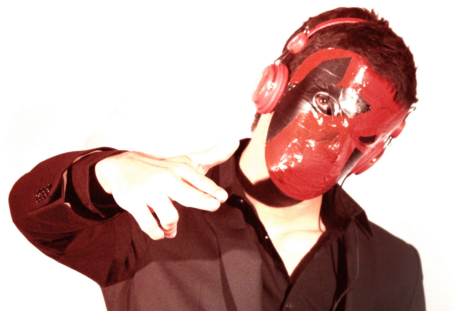
We wanted to create the masks for our DJs instead buying a mask that’s already made, since we knew that only we could create the hidden identities of Influx, and no one else. If our DJs actually existed this is what they would do because that would mean that the masks are more personal to the individual DJ and help present their personalities.
We bought a standard plastic white hockey mask and a few different spray paint and standard paint colours and the brushes and sponges required to manipulate the paint to personalise our design. Also we bought masking tape which is required to ensure the paint dries on the surface of the mask and create various patterns or shapes.
First, we covered the masks in masking tape. Michael then painted several coats of black paint on the mask and once it had dried he created arrow shapes using the masking tape and then painted all over it using red spray paint. Once this had dried he removed the masking tape to reveal the black arrows which are now on a red mask.
Adam first painted the bottom half of his mask in dark blue. He then used the black spray paint on the top off and held it upright slightly so that it would drip down the mask leaving the ominous black dripping paint. He used silver paint across the eyes in crooked lines for the final detail.
Hopefully, these masks will become the recognisable faces of Influx and will appeal to our target audience. They should create very different personalities for each DJ.
The deep vivid colours used in the masks will work well with the dress code of the band. The DJs will where completely black suits whilst the lead singer, Charley will wear a black dress. The masks in combination with the dress code will help to create a clear colour scheme of the band which is black, red, white and dark blue.
This video is in the mainstream dance genre with aspects of electronic and more recently, rap. Here the video is edited to fit all these genres. For instance, Tinie Tempah does his verse the editing still is more punchy like that of a rap video. To account for the dance and electronic aspect, there are many zooms and slo-mo to cut to the technically slow beat, although the track feels faster.
2)Relationship between lyrics and visuals
There is amplification of the meaning of the lyrics since the “earthquake” represents the bass speaker and this is shown through lots of bass speakers and effects, which symbolise a bass speaker.
There lyrics of the chorus are ‘I predict an earthquake up in here’ and whilst this phrase is being sung the camera will often shake or the singer will do something acrobatic like jumping or generally just move very fast.
Whilst these lyrics are being sung in the bridge, there are hooded clones of the singer, matching with the mysterious tone at that moment.
3)Relationship between music and visuals
Similarly, as the track hits the chorus meaning the music becomes more textured and lively, the singer will do some sort of acrobatic motion. Again, there is amplification of the music since the visuals match the rhythm and beat of the music.
As the song starts with the build up in the instrumental, the visuals are of pans up and across the body of the man singer without showing his head to create enigma.
Where the music is fast paced the visuals are cut relatively quickly but the speed is fairly similar throughout the video, except during the bridge where the cuts are much slower.
4)Close-ups of the artist and artist motifs
This track surprisingly consists of many extreme longs, and not as many close-up beauty shots as you would expect from such a mainstream music video. There are still the beauty shots of the artist from each different set up.
His sunglasses about to come up every now and then and so after researching Labrinth a little further it seems to be that glasses could be a feature of key iconography. They are part of his artist identity and add to his dress code, so when they are suddenly on it is more distinctive. It gets the audience aspiring to follow his style.
5)Reference to notion of looking
There are many shots of him looking away and out of shot, particularly at the beginning of the video during the build up and just after it. Sometimes he wears the sunglasses so we can’t see his eyes creating enigma, however we still get the impression that he is looking in a certain direction.
6)Intertextual references
At the beginning of the video you see him get out of a Mini Cooper, advertising this car brand through product placement. During the bridge when he is in the hood, you can withdraw connotations of Star Wars, also helped by the spherical object in the middle of the room, making it feel more futuristic and sci-fi.
7)Performance, narrative or concept?
This is definitely performance driven since there is no narrative flow. The majority of the video is the singer dancing and allowing his outgoing, party, lively personality to show through the choreography.