Click the image to go to the Influx website

Friday 16 December 2011

Post for the Moderator

Dear moderator,

Here is my finished blog. You will be able to find evidence of my progress through the year, showing my preliminary task, research & planning, production and evaluation.

You should find my blog is easy to navigate through via the links on the right side of the page and the hyperlinks connected to the many images and clips.

You may find particularly useful the links to my teammates' blogs (Michael Cassidy and Adam Romo).

Thank you for taking the time to read through my blog and I hope you enjoy it!

Daniel Sheldon - 3720

Thursday 15 December 2011

The blog is now closed!

The blog is now finished and I have completed my music video project. My group was fantastic and I really enjoyed working with them. I believe that all 3 tasks have been finished to a professional standard and so I am very happy with the end products and the commitment that we've put into this project as a group.

Monday 12 December 2011

Evaluation Question 4: How did you use new media technologies in the construction and research, planning and evaluation stages?


I feel that filming and editing this video storyboard in preparation of the actual narrative shoot was incredibly helpful in the production stage. This type of "hands on" research & planning is appropriate for my way of working and since I was director and cameraman for this sequence, it allowed me to be more time efficient on the day in terms of shooting the footage and arranging my actors as required. We used Web 2.0, a vast new media technology to advertise the video with the target audience on the social networking site, Facebook to then view the video and post feedback either on the post on Facebook itself or on the YouTube link.  This method of advertising requires minimal budget (it's free!) and it has potentially a global reach with no wastage. Another media student and avid social networker Charley Packham (who also played the teacher in our music video and 'Cassie' as part of our band !nflux) posted the video on Michael's wall on Facebook, and tagged Adam and I in the post.


Web 2.0 not only allowed me to get audience feedback on my research & planning stage, but it has also been resourceful in the evaluation stages too. In evaluation question 3, I gained the feedback through Facebook because this platform is easily accessible by the majority of the target audience. In AS media, when studying audiences in the film industry I came across a statistic saying that 96% of 16-24 year olds both male and female use social networking sites at least once a day. This fact let me understand that social networking sites like Facebook and Twitter were certainly a viable option of maximising reach for advertising.


Also, I did much of my evaluation on my Blackberry mobile phone because that meant I was able to note down points as and when I thought of them, I was able to use my time commuting more productively and it meant that when a new point was raised by someone else perhaps to do with audience feedback or a general point about the layout of my evaluation questions I was able to write this down.

NEW MEDIA TECHNOLOGIES IN EDITING


During post-production using new media technologies enhanced my final product significantly. I used CS5 Adobe Premier Pro to edit the music video and this state-of-the-art editing software allowed me to experiment with all kinds of special effects and brought me to the end product. Effects I believe particularly stand out are:

-Spherise- This allowed me to create visual bass feel by creating a "fish eye-like" effect on the beat in a couple phrases of the track. It is most effective where it is used in the first drop when I used in combination with the colour grading. When individuals saw this effect they were instantly amazed saying how "creative" and "unique" it was, with the overall reaction being "wow!"


-RGB curves- this is an effect used in colour grading to enhance or simply change the colour to whatever you like. The reason I prefer this tool to the other variations of colour grading effects is that you can control the removal or addition of colours with ease. I love the range of colour grading effects that you can produce using this tool because it adds a unique flare to my editing, something which I am proud of.


-Slo-mo- Heavy use of slo-mo is a convention of dubstep videos so I knew that having researched videos like 'Feel Good' by Modestep and the Bar 9 remix of Example's 'Kickstarts' it would be foolish to not include it. However, I and the rest of my group felt that these videos overused slo-mo and so we wanted to challenge this convention. The feedback received over this has been varied with a few people saying "there should have been more slo-mo", but the majority saying they "liked the specific slo-mo shots because they weren't overused."

          Slo-mo jumpshot sequence.


To conclude, without the new media technologies like Web 2.0 and the Blackberry mobile phone communication with the audience and my other group members would have been much more difficult and without the editing capabilities of CS5 Adobe Premier Pro this project wouldn't have come together at all.

Evaluation Question 3: What have you learned from your audience feedback?

Our audience demographic consists of a primary age group of 16-24 year olds because this is the age that has grown up with the discovery and development of dubstep. Also, this is the main age for becoming more independent and outgoing. Our secondary age group extends to 15-26, since this is really the limit for the age group where dubstep is popular. Also, you can get adults 30+ who still enjoy going to music festivals, concerts and clubbing, however this group is very niche. Dubstep appeals to both males and females and of course the fans of the dubstep genre.
To gain feedback of our music video, it was screened in the Seward Studio on a projector with the audience in raised theatre seating to ensure they could fully focus on the video. Around 120 people of both teachers and students watched the video, and then we asked 10 to participate in a focus group, in which they filled in a questionnaire.


An interview with Robbie Lardi, an 18 year old caucasian male from the target audience discussing his response immediately after viewing my music video.


After analysing the questionaires and putting together the individual feedback I've received from Robbie and others, I have learnt that:

- We have appealed to our primary audience demographic very successfully! The questionnaires filled in by those aged 17 or 18 gave us an average score of 9, with a common trend in those liking the uniquely fast paced editing.

- We have also appealed to the secondary audience. Those of whom I have asked in the 30+ bracket gave an average score of 8.5. Again, the general concensus says that the fast paced editing is appealing and this audience particularly liked the overlay strobe shots of each member of Influx during the bridge. They thought that visually it was unique, creative and led them to question how we did it, which is a positive.

- A very small minority of the primary audience said they couldn't follow the narrative that clearly, which I find interesting, however the vast majority said that they could see a clear progression in the increasing confidence of the teacher.

- I find it interesting that although most people enjoy the fast paced editing, those of the target audience who say they are hardcore fans of the dubstep genre believe that the video should still have been dominated by slo-mo shots and was more clearly cut to the technically slower beat of the track.

In hindsight, I would have added even more slo-mo to adhere to the expectations of the target audience, however I standby the fast paced editing since it was liked by the majority and was noted for its unique editing style. This is what got the audience talking about our music video and this what entices the audience into watching the video again. I believe that the most important aim in producing a music video is ensuring that it has high replay value, because then you know that you have engaged your audience.

Evaluation Question 2: How effective is the combination of your main product and ancillary texts?


The effectiveness of the combination of my main product and ancillary texts can be broken down into 5 categories where synergy is significant: genre, dress code, colour scheme, fonts & text and institutional information.

Genre

Influx is a dubstep artist, and so each media text needed to evince an urban, rave, underground feel. The artist needed to relate to the audience demographics in both the primary and secondary categories.

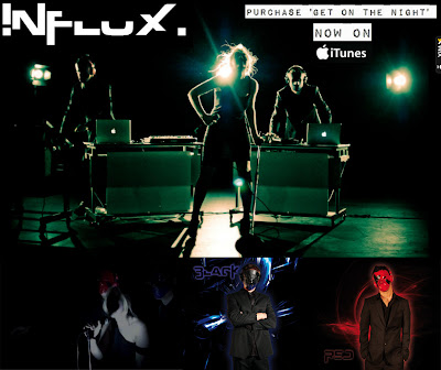
The colour scheme used is very specific to the dubstep genre. Black, white, red and dark blue all connote late teenage and young adult nightlife and the underground rave scene. This appeals to the fans of the genre since this relates to the lifestyle choices of the target audience. Through keeping with the colour conventions of the genre across each media text, synergy is created because the vibe created is completely clear and successfully promotes the artist identity.

The lighting in music videos of the dubstep genre must be high key, artificial, often strobe-like and colourful, but there must be areas of dark as well. Similarly to the colour scheme, dubstep is typically associated with this kind of lighting in nightclubs and so it was important to show this in the performance, but also high key lighting was required in the narrative after the drop because the adrenaline of the track kicks in here. This kind of atmosphere is replicated through the images used as the website background and the back cover of the album cover.
 

Dress Code

When Cassie joined the band her dress code had to fit in, so she is known for wearing her sexy, current & outgoing black dresses. The dress she wears in the video is also shown on the album cover and around the website because it is the kind of dress the audience would wear, meaning they can relate and would feel a more personal connection to the band.


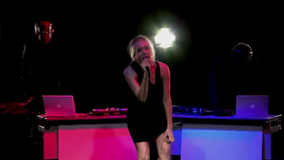
Black is a good colour to use in the background because it lets the other colours stand out because they are much brighter. Also, it should be noted that this is even more effective the video and website are shown on screens of electronic devices meaning that these colours look particularly vivid and eye catching when lit up.

Black is used in the background of the performance in the music video to emphasise the action. Since the website and album cover comprise of images from the performance shoot, they work in synergy by highlighting the other three colours, thus giving clarity of the atmosphere created by each media text to the audience.

The reds and dark blues are used to give individuality and personality to each DJ, so as not to confuse the audience. These colours were used in the masks, the lighting set up of the performance, in the grading of the music video at 3:20, merchandise in the store and to highlight the DJs and their names in the album cover. By using these colours in each media text, synergy is created as the colour scheme is promoted in every aspect of the artist.
 

Fonts & Text

Only a few fonts have been used. There isn’t just one font so certain information can be emphasized whilst looking aesthetically pleasing to keep the more serious information clear and easy to read and to make each text look more interesting.

The font used for the Influx logo is used on the album cover for the album name, the track list and the DJ names on the inside cover. The font itself is very electronic and rave-like and so helps to promote the brand image of Influx as a current dubstep artist.

The same font is used only in the logo on the website. This is effective in working in synergy with where it is used on the album cover; because this font is used purely to highlight the information we want the audience to first notice.

The font used with the institutional information is a sans serif font because it is clear and doesn’t divert attention from the exciting components of the website and album cover.

Institutional Information

The institutional information includes:

-      - the record label: Madhouse Records Ltd.
-      - the manager: Michael Cassidy
-      - the PR: Daniel Sheldon
-      - copyright information
-      - the record label’s website: www.madhouse.com/records

This information is placed strategically on the website and the cover. This means that should the audience want to find this information, they know exactly where to find it because it is in the conventional position.

-      - On the album cover it is on the back cover at the bottom where there is a bar code and a QR code.
-       -On the website it is located at the bottom to the right and is visible on every page.

These features are working in synergy since they are the same layout on both platforms meaning the audience can adjust for this.

The album cover has another more subtle for of synergy with the website. The QR code can be scanned by any smart phone with the correct application. This code is contemporary with the target audience and when scanned takes you straight to the Influx website.
SYMBIOTIC RELATIONSHIPS
We have worked in synergy with another media group called 'The Storm' to create a mutually advantangeous relationship by announcing a concert by Instict (the group organising the event) at the Camden Roundhouse where both Influx and The Storm will perform. We know that this event would be successful since we have incredibly similar target audiences due to the similarities in our respective genres of music, dubstep and drum & bass, both sharing a rave lifestyle in the fanbase. At this event we'd be able to release merchandise such as posters and clothing promoting the event and each artist individually as well as our motif, the DJs' 'Red' and 'Black' masks.


The event itself would be promoted on each band's website, on the UKF YouTube channel and on social networking sites, like Facebook and Twitter. These sites are crucial, particularly when we have the opportunity to utilise the potential of Web 2.0 through Facebook's selective advertising capabilities, thus maximising our reach to a global audience and minimising our wastage advertising costs.


Colour Scheme

Influx has the colour scheme of red, black, white and dark blue. This colour scheme is the same across each media text and each colour will be associated with specific components.
For example, the black can be found on the arrows of the red mask and the top half of the dark blue mask. This will never be different; they will always be this colour to avoid delivering a mixed message to the audience and confusing them.


The dress code of Influx in the performance matches those in the main background shots of the website and the promo shots on the front, back and inside album covers.

There is a very distinct dress code for the DJs – completely black suits and either a red & black or dark blue & black mask. We did this to make the DJs’ masks the recognizable face of Influx. This would work with the history of the band since ‘Red’ and ‘Black’ founded Influx.

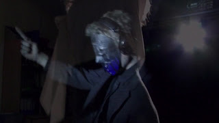
The black suits emphasise the masks, making them more eye catching, particularly the red mask. So, when they appear momentarily in the video or they are seen around the website, its almost like an image of the masks is burnt into their vision, like when looking directly at the flash of a camera. By creating this motif & a feature of the key iconography of Influx and placing it in the eyeline of the audience on each platform, the synergy works so that the audience get hooked on and always curious about the mysteriousness of Influx.
 

Evaluation Question 1: In what ways does your media product use, develop or challenge forms and conventions of real media products?

I have produced a dubstep artist called Influx for my media products. Dubstep has been up and coming in the rave scene over the last 5 or so years, and more recently has firmly taken its place in mainstream music. The artist, Influx consists of two DJs, Red & Black, and a singer, Cassie. It is conventional of dubstep artists to promote the song more than the artist themself in videos and I wanted to challenge this convention through creating a strong artist identity. When constructing the artist identity, however, we did use conventions by devising a hidden identity, keeping the vision of Influx's stage presence in live performances at the forefront of my mind.

Our Music Video


Our Website


 Our Album Cover


Andrew Goodwin

1) Genre Characteristics

Our media product is of the dubstep genre and naturally our music video includes many characteristics and conventions. There is clear use of slo-mo and faced paced editing, cutting to the beat and frame-by-frame cutting to give a flashing effect symbolising the atmosphere and visuals of a rave or nightclub. Slo-mo shots and shots with increased speed are used for emphasis i.e. there are changes in speed of the visuals to match that of the track (01:30 - 01:33). There are many handheld shots, spontaneous zooms and tilted angles to give a realistic natural feel, since many dubstep videos share this aspect.

2) Relationship between lyrics and visuals

The lyrics at the chorus are "Promises, and they still feel all so wasted on myself" and they have no relationship to the visuals of the music video itself, thus giving disjuncture.

3) Relationship between music and visuals

The rhythm and beat of the music strongly correlates with the activity in the visuals. This means there is amplification of the heavy beat of track when in combination with the visual cutting to the beat and going through slo-mo as the track seems to warp. The cutting is moderately quick and to the beat during the chorus' and then as the drop is building up there is an increase in pace and crosscutting between narrative and performance, up to the drop where it gets very fast with many visual special effects. During the bridge, the strobe overlay matches the tone of the track at that moment in time, which in turn amplifies the music.

4) Close-ups of the artist and artist motifs

Since this is a debut music video beauty shots of each member of Influx were always going to be pretty frequent, as is the case here. The lead singer, Cassie, has many beauty shots which are particularly scopophilic (such as the jump shot sequence at 01:34 - 01:36). It is clear the male gaze is taken into account since a fair proportion of the target audience is male. Enigma is created where there are close-ups of the DJs since it leaves the audience question who their real identities are. The masks of our DJs are a clear motif of the band, just as Nero has the glasses and Modestep has the yellow face.

5) Reference to the notion of looking

When the DJs look round the door as they come to collect Cassie from the classroom, there is a clear notion of looking.

6) Intertextual references

There is clear inspiration from Modestep's 'Feel Good' in terms of the narrative style where both narratives start off fairly serious and change to chaos. The backwards track shot just after the drop (01:27 - 01:28) is similar to the music video which we did a remake of in the summer 'Everybody Get up' by Five. Also, the first spherise sequence at 01:29 - 01:30 giving this bass feel to the visuals was inspired by a scene from the film 'Limitless'.

7) Performance, Narrative or Concept?

There is an equal balance of crosscutting between narrative and performance, giving a narrative and performance hybrid. The common aspect of each part is Cassie who is the teacher of the narrative as well as the lead singer in the performance and is part of Influx. The connection is there because we see the DJs take Cassie into the performance which the audience has seen the whole time.

Carol Vernallis

1) Narrative

  • The narrative visuals bear very little relationship with the lyrics, however they strongly correlate with the music. For instance, during the verses the action in the narrative very much sets the scene and consists of the students being bored and the teacher just getting on with her work. As the verse progresses, the visuals continue to match the music by showing the class become more rowdy and then when the drop hits the narrative shows the classroom in chaos.
  • There is a balance between narrative and performance. They are shown equally, however the lead singer, Cassie is the connection between them since she is also the teacher.
  • The narrative has closure at the end, although it may seem rather fragmented throughout the video. Nevertheless, the audience can accept this because it is typical of dubstep to have clear contrasts in tone in the track and so during the drop, the narrative visuals show many different clips and highlight individuals. All in all, the narrative still follows a path on a set direction, with the DJs taking the teacher to the performance, where the song ends.

2) Editing
  • The editing style matches the phrases if the track, in particular detail in the drop. For example, as the track warps, the visuals slow down, speed up and slow down again, amplifying the music. Also, the single three notes that are clear in between each phrase in the drop have three shots which are emphasised by some editing technique, such as spherise or cutting to black.
  • The editing style is incredibly unique, and so advertises itself. Clearly, the creative use of special effects and colour correction makes the video stand out against other videos of its kind.
  • Continuity editing does not exist, although there is an order in which the events of the narrative progress. There is a large use of jump cuts, and breaking the 30 and 180 degree rules.
3) Camera Movement and Editing
  • The camera movement and framing depends on the tone of the song at that moment in time or in individual phrase. For example, the first verse consists of many slow pans and stationary shots in both narrative and performance. The distances always vary from long shots to close ups with the use of extremes for emphasis.
  • Jaunted angles, handheld camerawork and fast zooms dominate the visuals during the drop sequences since they connote a rave and underground vibe.
  • There are specific points where there are zooms which match the visuals or the music. At 01:59 there is a zoom from LS to ELS and then back to LS in time with the music. Similarly, at 03:34 there is a faster zoom which is on the beat and matches the action of 'Red' the DJ.
 4) Diegesis

  • It is clear that the narrative takes place in a classroom due to the role of the teacher, the students and the fact that there is students' work on the walls. The lighting in the narrative starts of as low key and naturalistic, however after the first drop the lighting changes instantly to high key with high contrast settings in the grading. This remains for the rest of the narrative.
  • The performance has three lighting set ups. Most commonly used is the set up which shines a white spot light on Cassie, a blue spotlight on the DJ 'Black' and a red spotlight on the DJ 'Red', with blinder lights around the back. Another set up has no coloured filters and no spotlights to create a silhouette. The finally set up is the use of strobe lighting which appears throughout the video even though it may just be a few frames at a time.
  • It could be suggested that the performance is in the same kind of world as the narrative, because the DJs collect Cassie and take her to the performance just before the second drop.
  • Often, actions will be disrupte by repeating frames to give a fast paced although static visual which matches the electronic element of the track.


Friday 9 December 2011

Audience Screening in the Seward Studio

All the music videos which have been produced during this A2 media course were screened in the Seward Studio today at 12:45, lunchtime. It was a public screening with a turnout of over 100 people including teachers and students of ages 11-18. The event was advertised via posters around the school and through an event on Facebook which was created purely to engage the audience. Through the event page,  messages were sent out to everyone that had been invited to the event and on the event wall was a short 1 minute trailer which had been created to hook the audience.


I am very grateful for the fantastic response we received to our music video and I am glad to say the screening proved successful for all groups and was incredibly helpful for our feedback on the videos. At the screening everyone was given a sheet with the names of each group and a brief description for them to vote on which video the preferred most. The results will be entered into the 'Laftas', an award night for Latymer Media projects being held next year, into the category of the 'Peoples Choice Award'.

Monday 5 December 2011

Potential snagging points

After our music video was seen by other media students, the feedback received was that there wasn't anything that we had to change. Which was fantastic news! There were two points which were brought up, however that if we wanted to change would be down to our personal preference. These points were:

1) The slo-mo jump shot phrase of the 'girl in the green top' doesn't last long enough.

2) The shot where the 'boy who is listening to the music' high fives the boy next to him is too early. It should be after the drop.

As a group we decided these ideas weren't beneficial to the video since we felt the video in these areas already appealed to the target audience as best as it can so it wouldn't be necessary to change this.


So I can definitely say we are fully signed off here!

Sunday 4 December 2011

We are signed off!

For the last few weeks we have been working incredibly hard editing our various tasks and encountering new problems along the way. But now I am happy to say that we have had a production tasks all signed off, with Mrs Blackborow becoming teary eyed after watching the music video!

It must be said that there were a few changes to make to the album cover and website, however I am pleased that these amendments weren't too difficult to make and we are now signed off!

Friday 2 December 2011

The Website


Michael used an online website designing programme called 'Wix' which allowed him to create a website from scratch!

He had to ensure that the website was easy to navigate, user-friendly and clearly promoted the artist. By taking inspiration on our research of a debut website (i.e. One Direction - the post of my research for this site can be found on my blog by clicking the research & planning label) he was able to produce a website where the interactive and purchasing opportunities were clear to the audience.

In terms of interactivity, we have links to the Influx Facebook page and the Influx Twitter account to make optimum use of Web 2.0, there are links to YouTube and Spotify to help promote the band. There is a forum page on the website where the audience is able to talk to the band and amongst each other perhaps to  discuss the debut video or the competition. Which leads me to the competition page. Here, the audience is able to download the individual components of the track from our SoundCloud account, produce their own mixes at home on their personal computer and then submit them to our competition. The 3 best mixes, as voted by the band, will have their tracks released in their own album as part of the Promises - EP. I feel that the interactivity which has been incorporated into our website is of professional standard.

In terms of purchasing, there is a link on every page to iTunes where you can buy the album 'Get On The Night' and the single 'Promises'. The events page is purchasing opportunity for the audience since they can purchase tickets to see Influx and both of these events. Of course, there is the shop as well which is easy to navigate and when you click on an item in the shop page you would be taken to a separate site which consists of the full Influx store.

The institutional information is clearly located at the bottom of the site and can be seen on every page. The same institutional information that can be found on this site, can also be found on the album back cover.


The website has now been signed off!

Mrs Blackborow's second viewing of our music video

Today we asked Mrs Blackborow to view the video with the hope that she'd be please enough with the video to sign it off. After watching it, she became teary eyed and said that it was "excellent" and she was really proud of the quality of the edit. She was pleased to see that we had taken into account all the feedback she gave us previously.

Her only critique was that she would like the video to begin by fading in from black because the first shot of the teacher's feet is poorly lit.

Overall, she was very pleased with the final edit and so are we. We may not have been signed off with the video but at least we know we are very close and I am relieved to see that on the whole our video is much liked. On monday we will find out about snagging points if necessary.

Tuesday 29 November 2011

Staying Late

Today, my timetable meant that I had around 4 and a half hours in school where I was able to edit and as there was a school production that evening too I was able to stay till 10 o'clock in the evening to maximise my time in the edit suite. After spending all the time in the edit suite, including breaks I edited the whole first drop, along with the build up and transition into the next verse. I feel my time was used incredibly productive since I experimented with lots of new tools that I had never used before and came across this one tool which I'd never seen before but I had hoped to find. The spherise tool let me do this blowing up screen effect, similar to what I had seen in the club scene in the film 'Limitless' and I had brought this effect to the attention of my group early on in the project.


I showed this clip to Chris, our media technician and he thought it looked superb. He asked how I managed to do it and more particularly he was interested in how I gave the shot a vivid cyan overlay. Again I found this through experimenting with the effects and I actually achieved this by mistake. In the colour correction section, I used the RGB curves tool because I wanted to increase the amount of red, but when I dropped the reds and came across this colour I felt this actually looked a lot better.

Sunday 27 November 2011

Mrs Blackborow's first viewing of our music video

We showed her the video when the rough edit and a decent proportion of the fine edit is complete so we were able to get thorough feedback. She told us to make three amendments:

1) She understood that the narrative shows the teacher going through a progression of confidence, however the stages of her character development needed to be in the correct order, when at the moment it is not. So we need to amend for this, which will only require moving a few shots around.

2) The transition where the teacher starts accepting the chaos and joining in needs to be more obvious. For this I need to arrange the slo-mo jump shots to allow more time to see the teacher letting down her hair.

3) The pace of the build up to the first drop is too fast. To change this I need to remove much of the strobe and slow down the shots showing the students getting up.


Other than this she feels the video is of high quality editing, and although there is still time and room for improvement, the presentation of the narrative was clear and enjoyable to watch in combination with the performance.

Friday 25 November 2011

Designating Roles

During the post-production stage we knew we needed to be efficient in managing our time so we designated the three task between us. Adam concentrated mainly on the album cover, Michael on the website and I on the video. Conveniently, we were able to position ourselves in the roles which we all preferred to do. This will allow us to produce the best possible quality products we can because we will have no problem in focusing on our individual task and producing the correct amount of work to the deadlines we set ourselves.

Tuesday 22 November 2011

Second Performance Shoot

Today we had the second performance shoot which is also our final shoot all together!

This time round we were much more prepared, having planned out the shots we missed out from the first shoot and we were much more efficient in setting up the lights and also getting into character since we had the confidence from the last time.

We had to make sure this time that we corrected an issue with the camera which resulted in grainy footage from the last shoot, but that wasn't a problem.

I'm happy to say the shoot was a success and I can't wait to watch the footage back when we capture.

Sunday 20 November 2011

Inspiration for my music video

The track we have selected is the Skrillex remix of Nero's 'Promises'. It is dubstep and since I am a fan of the dubstep genre I feel that I will be able to produce a high standard end product since I understand the conventions of music videos of the genre, like excessive slo-mo, fast paced action in the narrative, either the artist has a hidden identity or doesn't show themself at all and usually videos have a very urban and rough feel to them. Here are a few music videos which inspire me:


Modestep - Feel Good


Modestep - Sunlight


Example - Kickstarts (Bar9 remix)


DJ Fresh - Louder (ft. Sian Evans)


Skrillex - First of the year (Equinox)


After watching the film 'Limitless' I was stunned to see the creativity and individuality of the cinematography. There was one scene in particular which can relate to a music video. The main character is in a club and the visuals have been edited to give an effect where the screen pops out like a bass speaker. This is hopefully an effect I will be able to achieve in my music video.

Thursday 17 November 2011

Promo Shoot

Today, we conducted a promo shoot for our artist, Influx, in order to promote our artist image and create images for the fanbase on our website and album cover.

We varied the depth, lighting and mood of the shot to entice the audience into divulging further into our campaign.

At first, we used the same costumes we wore when shooting the performance for the music video (Charley: sophisticated black dress with a dropped shoulder strap, DJs: Black suits, shirts and shoes, along with our iconic masks and headphones.)

We then changed the costume for added interest and variety.

Finally, we had another costume change so that the DJs were wearing casual clothing, with particular emphasis on wearing a hooded jumper, since this type of clothing is commonly associated with the clothing that is worn by the target audience. With this added grunge look, we can look to reach further into our target audience because it allows the audience to relate to the band, and this interactivity that is contemporary and very popular with the audience.

Here are a few of the shots taken that dat which have been edited for the website.


Weetabix Chocolate Spoonsize Advert 2011


I love this advert so much and when I first saw it in the adverts during the XFactor my mouth dropped in amazement. As soon as I could I went straight to YouTube and watched it again. I feel compelled to blog about this since I understand that this effect of replayability being a must-do is crucial and of vital importance in our own music video.

This is a commercial advertisement presented as a dubstep/house music video, which is relevant to my media project. There are clear examples of cutting to the beat and showing that the action and choreography of the girl, dancing teddy bears and movement of objects in the room is to the beat as well. My favourite part of the video is the drop where the camera pans, zooms out and in with the stationary objects and furniture of the room all moving in time with this slo-mo change in pace of the track. Visually, it looks incredible and its this experimenting with the camera which I can withdraw from the most in this advert and use it to my advantage in my music video.

Wednesday 16 November 2011

Detailed album cover analysis


I’ve decided to analyse the album cover for Muse’s album `Black holes and Revelations` more closely. This album was released in 2006 and targets an audience of around 16-35s both male and female with its very mainstream music.

I feel that the cover most noticeably uses a blue and orange colour scheme since these colours are known for working well together due to their position as opposites in the colour wheel. These colours have been strongly saturated and contrasted to create more vibrant colours. Also, these colours have been set to divide the cover between top and bottom, perhaps dividing the black holes above from the revelations of the music below.

A quirky band identity is conveyed through the iconography by having 4 bald men sat around a table on this red planet (connotations of mars) even though these people aren’t the band members. Doing this also adds a mysterious feel to the album with enigma.

The artist’s name and album title goes against conventions through being black on a dark blue background so that it isn’t as prominent as expected on the cover. Perhaps this is because it is one of their later albums (their 4th album released) and so they can get away with not promoting their name as strongly.

The background image of the red planet flows onto the back cover to creating this sense epicness and enigma towards the content of the album. the track lsit is written in white so it doesn't distract you from the background image and institutional information (bar code, record label etc) is conventionally placed alogn the bottom so the audience knows where these features are immediately.