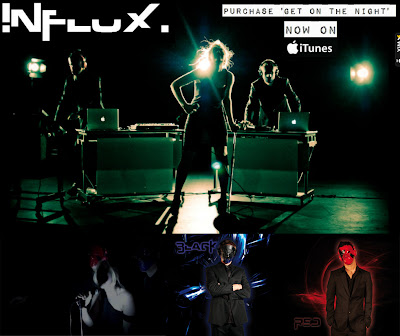
The effectiveness of the combination of my main product and ancillary texts can be broken down into 5 categories where synergy is significant: genre, dress code, colour scheme, fonts & text and institutional information.
Genre
Influx is a dubstep artist, and so each media text needed to evince an urban, rave, underground feel. The artist needed to relate to the audience demographics in both the primary and secondary categories.
The colour scheme used is very specific to the dubstep genre. Black, white, red and dark blue all connote late teenage and young adult nightlife and the underground rave scene. This appeals to the fans of the genre since this relates to the lifestyle choices of the target audience. Through keeping with the colour conventions of the genre across each media text, synergy is created because the vibe created is completely clear and successfully promotes the artist identity.
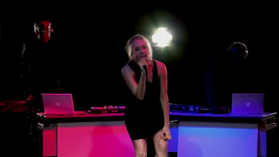
The lighting in music videos of the dubstep genre must be high key, artificial, often strobe-like and colourful, but there must be areas of dark as well. Similarly to the colour scheme, dubstep is typically associated with this kind of lighting in nightclubs and so it was important to show this in the performance, but also high key lighting was required in the narrative after the drop because the adrenaline of the track kicks in here. This kind of atmosphere is replicated through the images used as the website background and the back cover of the album cover.


Black is a good colour to use in the background because it lets the other colours stand out because they are much brighter. Also, it should be noted that this is even more effective the video and website are shown on screens of electronic devices meaning that these colours look particularly vivid and eye catching when lit up.
Black is used in the background of the performance in the music video to emphasise the action. Since the website and album cover comprise of images from the performance shoot, they work in synergy by highlighting the other three colours, thus giving clarity of the atmosphere created by each media text to the audience.
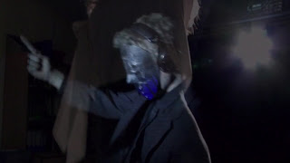
The reds and dark blues are used to give individuality and personality to each DJ, so as not to confuse the audience. These colours were used in the masks, the lighting set up of the performance, in the grading of the music video at 3:20, merchandise in the store and to highlight the DJs and their names in the album cover. By using these colours in each media text, synergy is created as the colour scheme is promoted in every aspect of the artist.
Fonts & Text
Only a few fonts have been used. There isn’t just one font so certain information can be emphasized whilst looking aesthetically pleasing to keep the more serious information clear and easy to read and to make each text look more interesting.
The font used for the Influx logo is used on the album cover for the album name, the track list and the DJ names on the inside cover. The font itself is very electronic and rave-like and so helps to promote the brand image of Influx as a current dubstep artist.
The same font is used only in the logo on the website. This is effective in working in synergy with where it is used on the album cover; because this font is used purely to highlight the information we want the audience to first notice.
The font used with the institutional information is a sans serif font because it is clear and doesn’t divert attention from the exciting components of the website and album cover.
Institutional Information
The institutional information includes:
- - the record label: Madhouse Records Ltd.
- - the manager: Michael Cassidy
- - the PR: Daniel Sheldon
- - copyright information
- - the record label’s website: www.madhouse.com/records
This information is placed strategically on the website and the cover. This means that should the audience want to find this information, they know exactly where to find it because it is in the conventional position.
- - On the album cover it is on the back cover at the bottom where there is a bar code and a QR code.
- -On the website it is located at the bottom to the right and is visible on every page.
These features are working in synergy since they are the same layout on both platforms meaning the audience can adjust for this.
The album cover has another more subtle for of synergy with the website. The QR code can be scanned by any smart phone with the correct application. This code is contemporary with the target audience and when scanned takes you straight to the Influx website.
SYMBIOTIC RELATIONSHIPS
We have worked in synergy with another media group called 'The Storm' to create a mutually advantangeous relationship by announcing a concert by Instict (the group organising the event) at the Camden Roundhouse where both Influx and The Storm will perform. We know that this event would be successful since we have incredibly similar target audiences due to the similarities in our respective genres of music, dubstep and drum & bass, both sharing a rave lifestyle in the fanbase. At this event we'd be able to release merchandise such as posters and clothing promoting the event and each artist individually as well as our motif, the DJs' 'Red' and 'Black' masks.
The event itself would be promoted on each band's website, on the UKF YouTube channel and on social networking sites, like Facebook and Twitter. These sites are crucial, particularly when we have the opportunity to utilise the potential of Web 2.0 through Facebook's selective advertising capabilities, thus maximising our reach to a global audience and minimising our wastage advertising costs.
Influx has the colour scheme of red, black, white and dark blue. This colour scheme is the same across each media text and each colour will be associated with specific components.
For example, the black can be found on the arrows of the red mask and the top half of the dark blue mask. This will never be different; they will always be this colour to avoid delivering a mixed message to the audience and confusing them.
The dress code of Influx in the performance matches those in the main background shots of the website and the promo shots on the front, back and inside album covers.
There is a very distinct dress code for the DJs – completely black suits and either a red & black or dark blue & black mask. We did this to make the DJs’ masks the recognizable face of Influx. This would work with the history of the band since ‘Red’ and ‘Black’ founded Influx.
The black suits emphasise the masks, making them more eye catching, particularly the red mask. So, when they appear momentarily in the video or they are seen around the website, its almost like an image of the masks is burnt into their vision, like when looking directly at the flash of a camera. By creating this motif & a feature of the key iconography of Influx and placing it in the eyeline of the audience on each platform, the synergy works so that the audience get hooked on and always curious about the mysteriousness of Influx.


